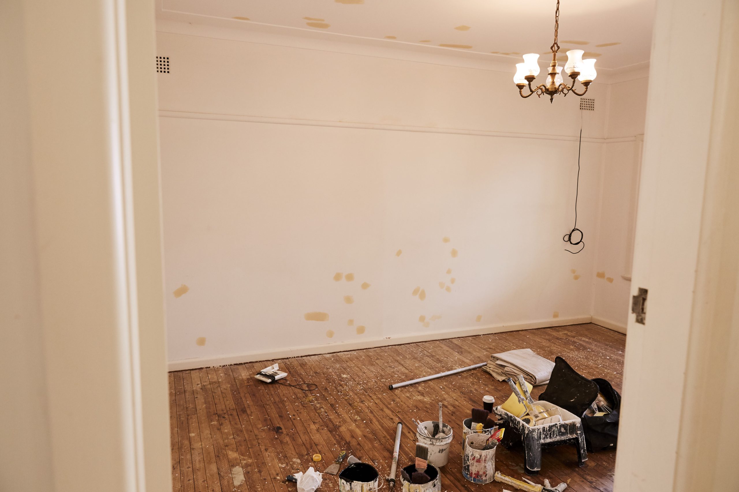
What is that old saying? All it takes is a coat of fresh paint? Well if that ain’t the truth… As it turns out, my penchant for all things vintage also applies to houses, so we are now the proud owners of a loveable, run down 1950’s asbestos shack with a world of problems and a fantastic view.
Our dream is to renovate, using and learning sustainable building practices where possible, but as with all dreams this one will take some penny saving and hard work. Til’ then, we wanted to find the most cost effective and ‘green’ way to breathe new life into her tired old walls.
In this interview, Rowena Davies shares the wisdom of paint from her thirty years as the innovative creative and genius of eco paint brand Murobond. Why did we choose Murobond? Let the paint speak, people… let the paint speak.

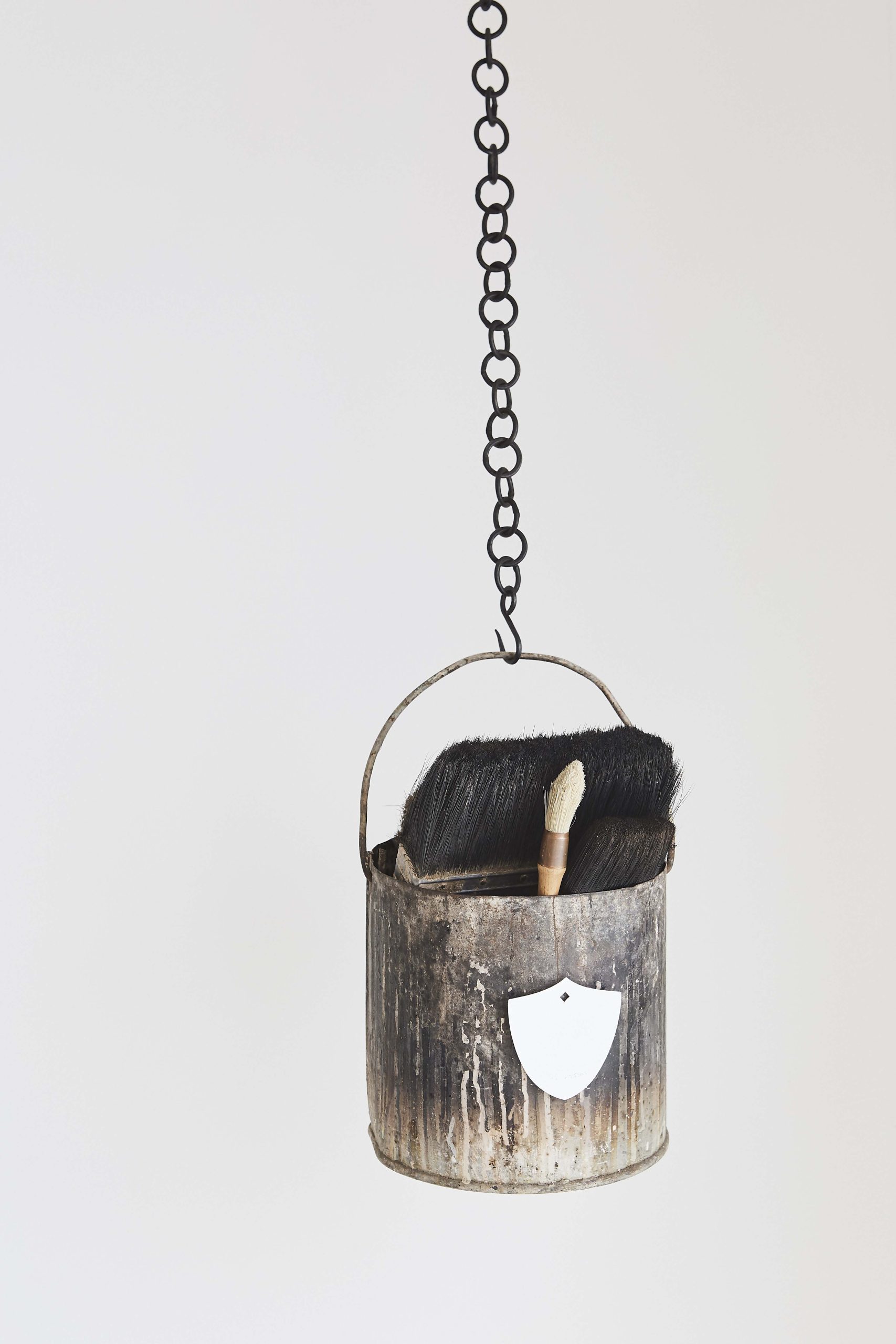
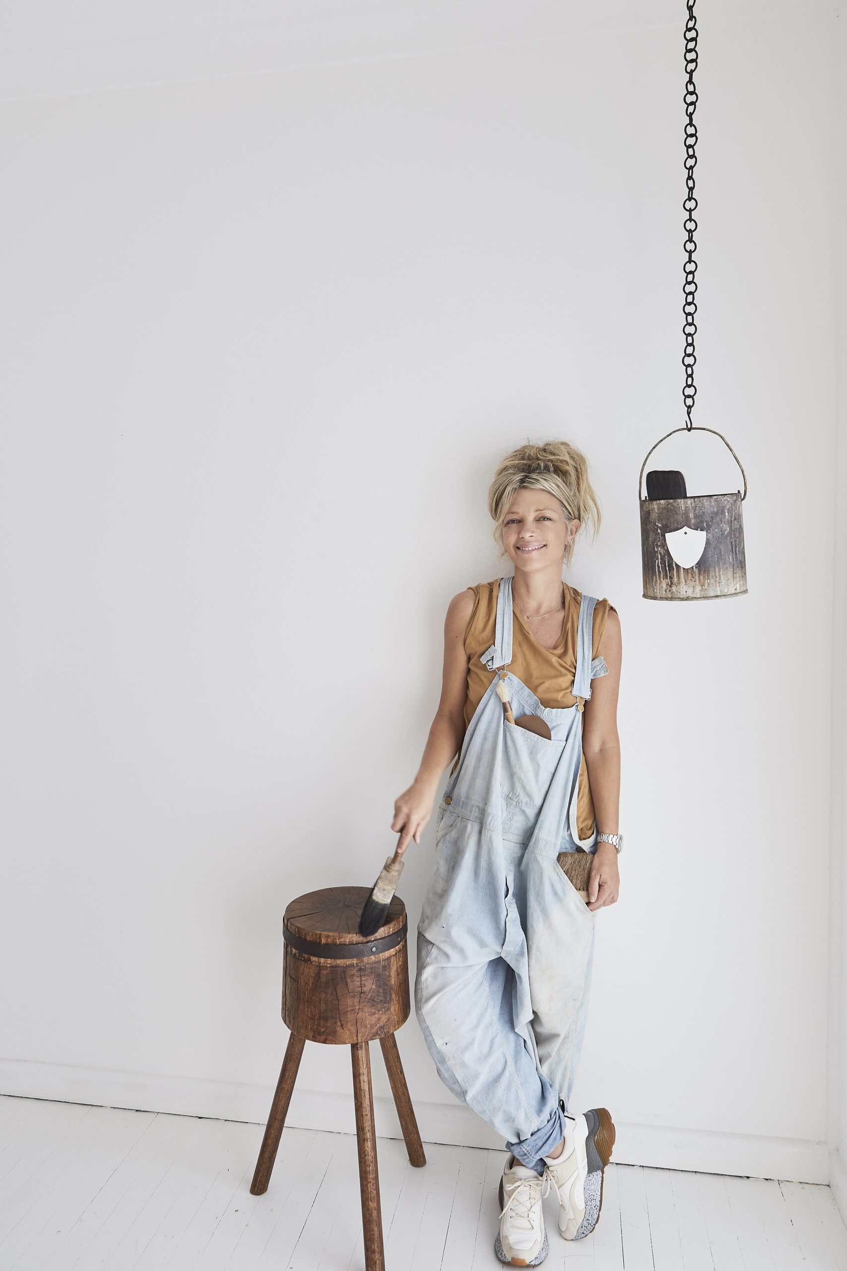
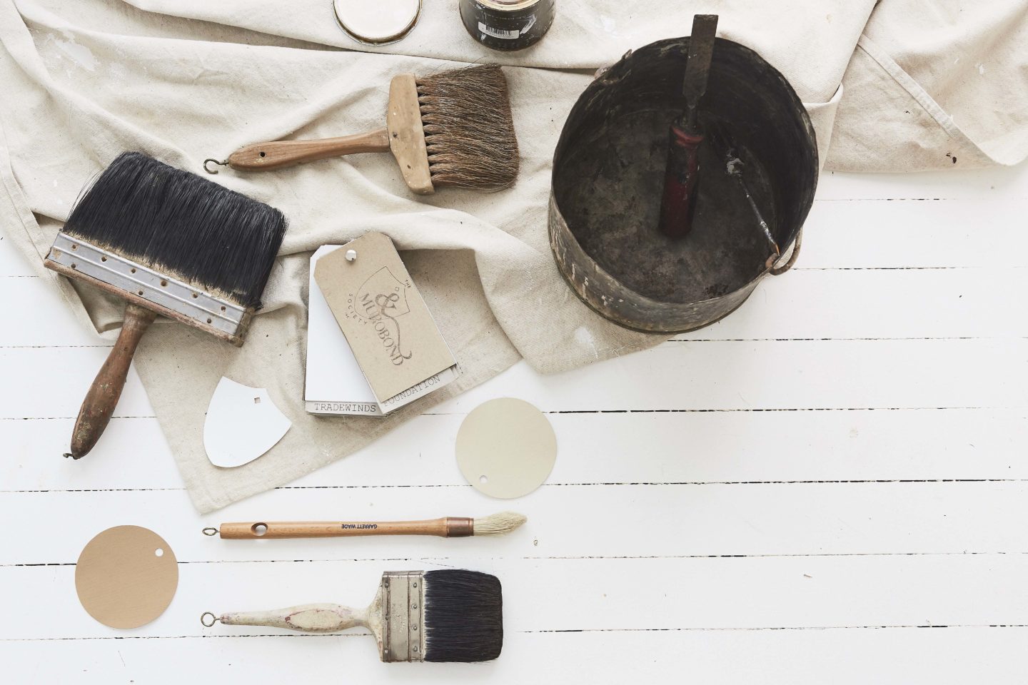
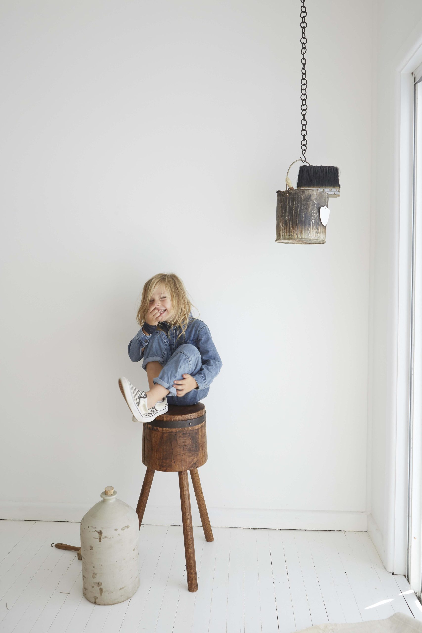
Paint accessories from The Society Inc. Sheree wears vintage overalls and Stella McCartney sneakers.
How did you end up in the world of paint? Tell us your story?
Despite working in the corporate world of commerce, I had always loved reading design journals and enjoyed making my own home full of interesting colours, finishes and objects. A chance meeting with friends who were working in the industry introduced me into the world of paint & colour – thirty years on I am still loving what I do.
As you know we are huge fans of Murobond and what you have created. Everything about the brand feels artisan and special. Your environmental stance on paint began long before the industry was having this impactful conversation. Can you share with us why Murobond paints are safer for the environment?
Ingredients for all our paints are sourced locally wherever possible. Our manufacturing practices are based on the lowest possible impact on the environment. Murobond cement and silicate paints are made from naturally occurring mineral bases and tinted with natural oxides, making them one of the most environmentally sound paint products available.
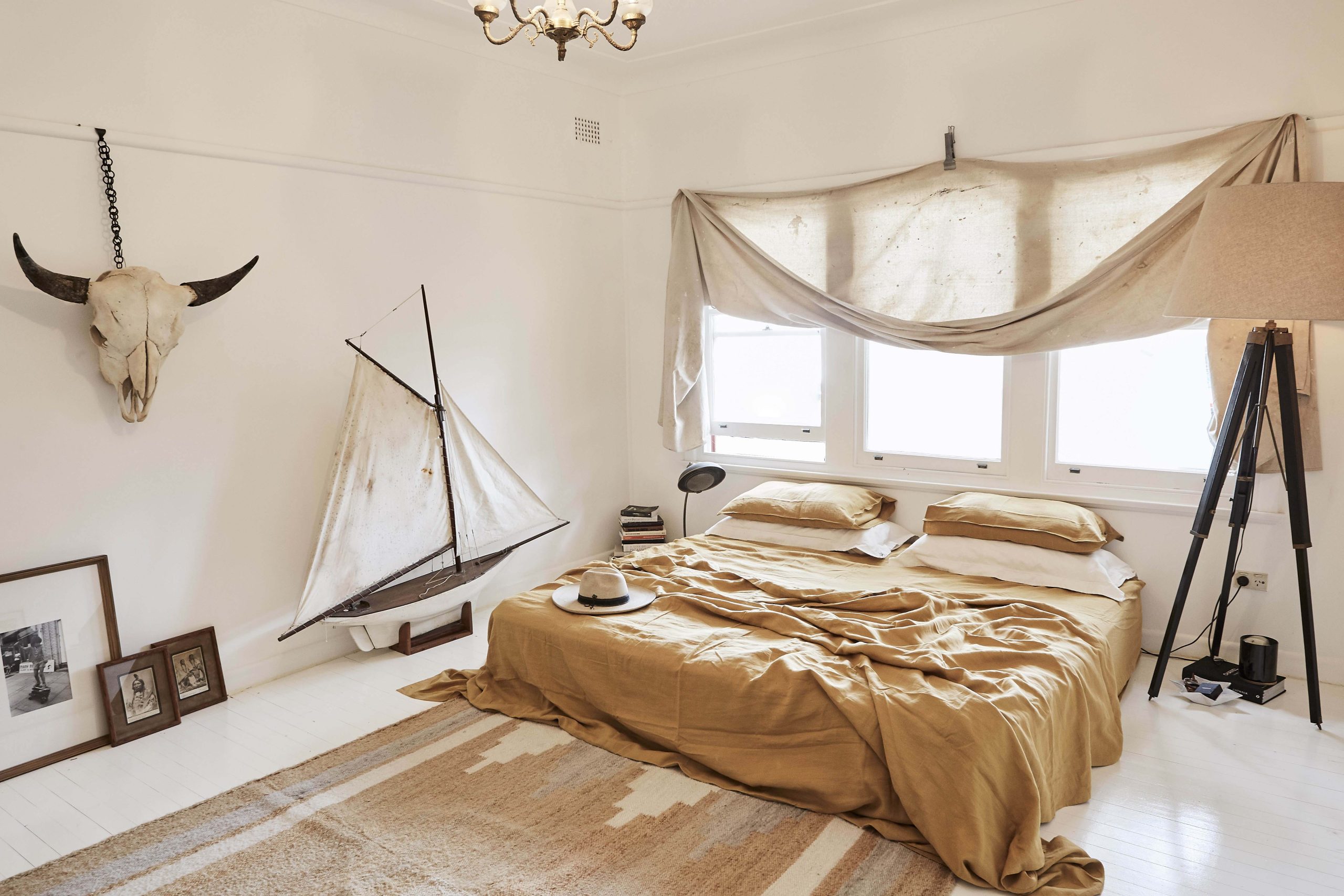
Mustard linen sheets and pillowcases from In The Sac, King size canvas pillowcases are Pony Rider
More and more people are becoming environmentally aware when it comes to renovating. Has Murobond seen a shift in the environmental attitude of customers? How far have we come/how much further do we need to go?
Murobond is always looking ahead of where the market currently stands on environmental standards. The biggest shift we have seen over the past 10 years is the move away from enamel and oil based paints. There are many positive outcomes such as less environmental impact, much lower odour and less discolouration of paint over time.
Despite these very real positive outcomes for both the environment and health the real challenge is acceptance by the customer (including painters) – education about the benefits is essential. As people decide to choose the environment and health benefits over product cost we will be able to implement more and more of the changes we’d really like to make. Change is always a slow process!
I was drawn to working with Murobond not only because of your sophisticated, down to earth colours and finishes but because sustainable practices and a respect for nature lay at the heart of the company. What’s your message to budding renovators or painting enthusiasts?
Research & plan well. Always acknowledge what you are good at and where you will need help. Calling in the professionals can save lot of time, money and stress in the long run. In terms of incorporating sustainability into projects, be sure to seek quotes from companies offering environmentally sound products. Strangely, many tradespeople and consumers equate Murobond’s sophistication with higher prices. We are actually very cost-competitive and with many add-on services including true expert advice we offer very good value.
I would also recommend renovators start a visual diary well before the project is due to begin. This acts as a visual bridge to express your expectations for your renovation to tradespeople, architects and designers. It also helps you as a renovator to develop a stronger, cohesive sense of what you want – although, be mindful not to simply build a book of dreamy unachievable tear sheets from your favourite magazines! That will only lead to disappointment. Be realistic about your budget, your site and your family needs – eg. All white chalky interiors look stunning in a magazine but if you have to spend your day chasing out your toddlers then it won’t work for your family!
Finally, I recommend you invest in quality elements that are best for family and environmental sustainability over trend.
Picking the right paint colour for your home comes naturally to some people, but for others it can be really difficult and very overwhelming. Do you have a step by step process or tips on how to confidently choose a colour that is right for you?
I am constantly gathering reference materials of things they inspire me – my file dates back 30 years! Use these references as inspiration to guide you because although fashions change, what we love rarely does. A mood board is always a great way to view design & colour and getting the balance of elements right.
When it comes to choosing the right paint colour for your home there are several key elements to consider:
- Narrow down your choices to a general palette (eg. greys or blues) and get samples in several colours from this palette in the finish you will be using.
- Consider the light. Colour is incredibly light affected so you must look at colours in situ. Paint samples in all of the intended areas and watch how they change throughout the day – what looks fresh in direct morning light can look dull and unacceptable in afternoon light. Likewise, the colour of the north facing front of the house can look a very different colour the south facing rear of your home.
- Consider texture as part of the equation too – test as you would for light on the different surfaces because timber, concrete, masonry etc. can reflect light differently and affect how the colour is perceived.
- Colours generally read ‘cleaner or sharper’ than what you would expected – so for example a bright white could end up looking too clinical. I generally like to ‘dirty’ colours off a little to make them sit well.

Pony Rider bedding
What is one of the biggest mistakes people make when choosing a paint or color scheme for their home?
One of the common errors people make is choosing what is in fashion or colours their friends have used rather than considering the unique aspects of their home.
As you know I am a big fan of your collaboration with my good friend Sibella Court. I loved painting the entire interior of our house with Whalebone, one of The Society Inc by Murobond colours. Can you tell us about this collaborative process and what makes these palettes so unique?
The collaborative process with Sibella spanned 5 years. We introduced 11 palettes throughout this time which were drawn from Sibella’s private collections and travels. Her inspiration included leaves; vintage tulle; costumes from her mother’s textile collections; old letters; feathers; ribbons; stamps and antique beads. From these materials, we put together stories with colours to create our Society Inc. Palettes. Each of these palettes cleverly tells a unique story and, when used in the correct balance, all colours work beautifully together.
What are some key sustainable practices every painter should put in place?
Choose paint products that have a lower environmental impact. Dispose of left over paint at an approved recycle centre – do not tip paint down drains! Try to calculate quantities so as to not over order, minimising paint disposal.
Murobond is renowned locally and internationally, and you’ve worked on a number of incredible projects over the years. What’s been your standout and why?
For the past 30 years Murobond has been involved in many outstanding and significant projects across Australia. The stand out that comes immediately to mind is the Newport Mosque Melbourne. Internationally acclaimed architect and Pritzker Prize awarded architect Glenn Murcutt, in collaboration with Hakan Elevli, used Murobond Aquaglaze Pearl ‘Golden Silk’ for the 96 ‘Lanterns’ on the roof of the building. Seeing our paint used in such a significant way on such an important building was very rewarding for the Murobond team.
Of course, it is equally rewarding to have customers or designers coming back satisfied after residential projects – especially those that were demanding in one aspect or another. Seeing a project come to completion with great results is always good – regardless of size.
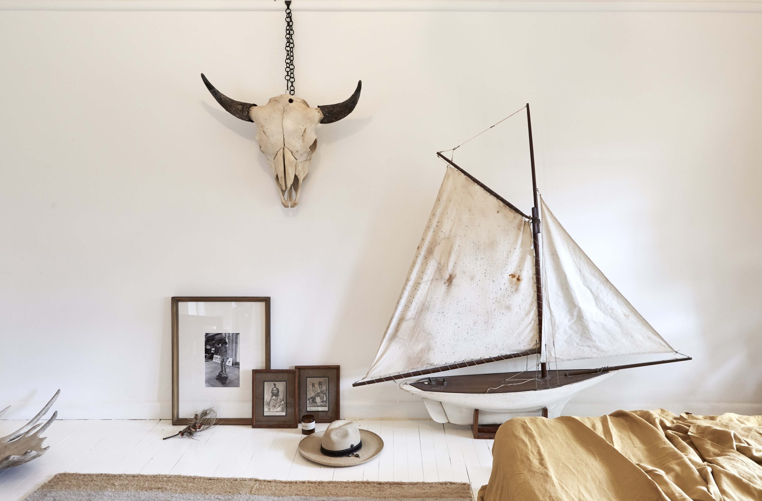
Custom tapware by Reidsdale & Co., door handles by The Society Inc.
WHAT PAINT COLOUR DID WE CHOOSE?
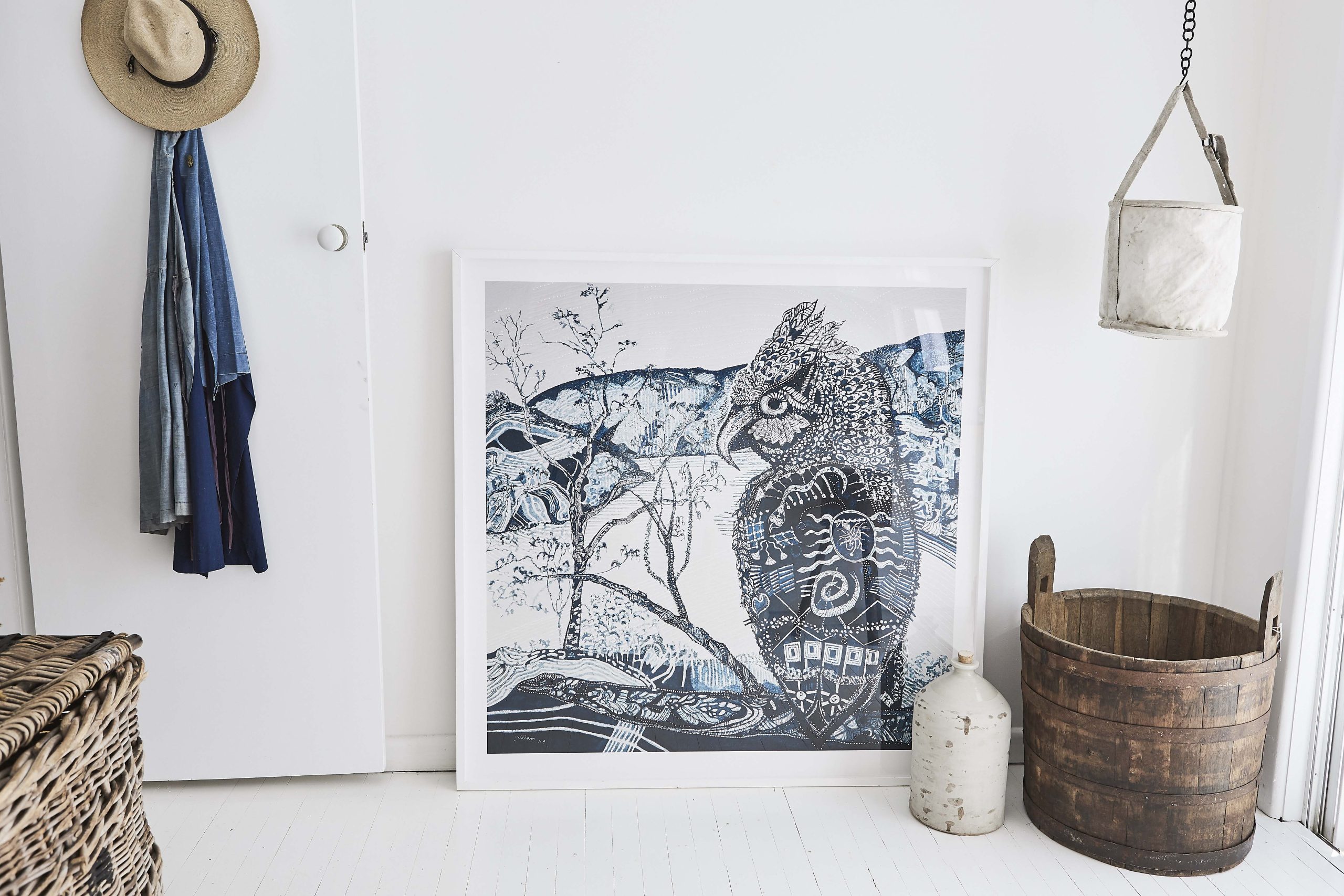
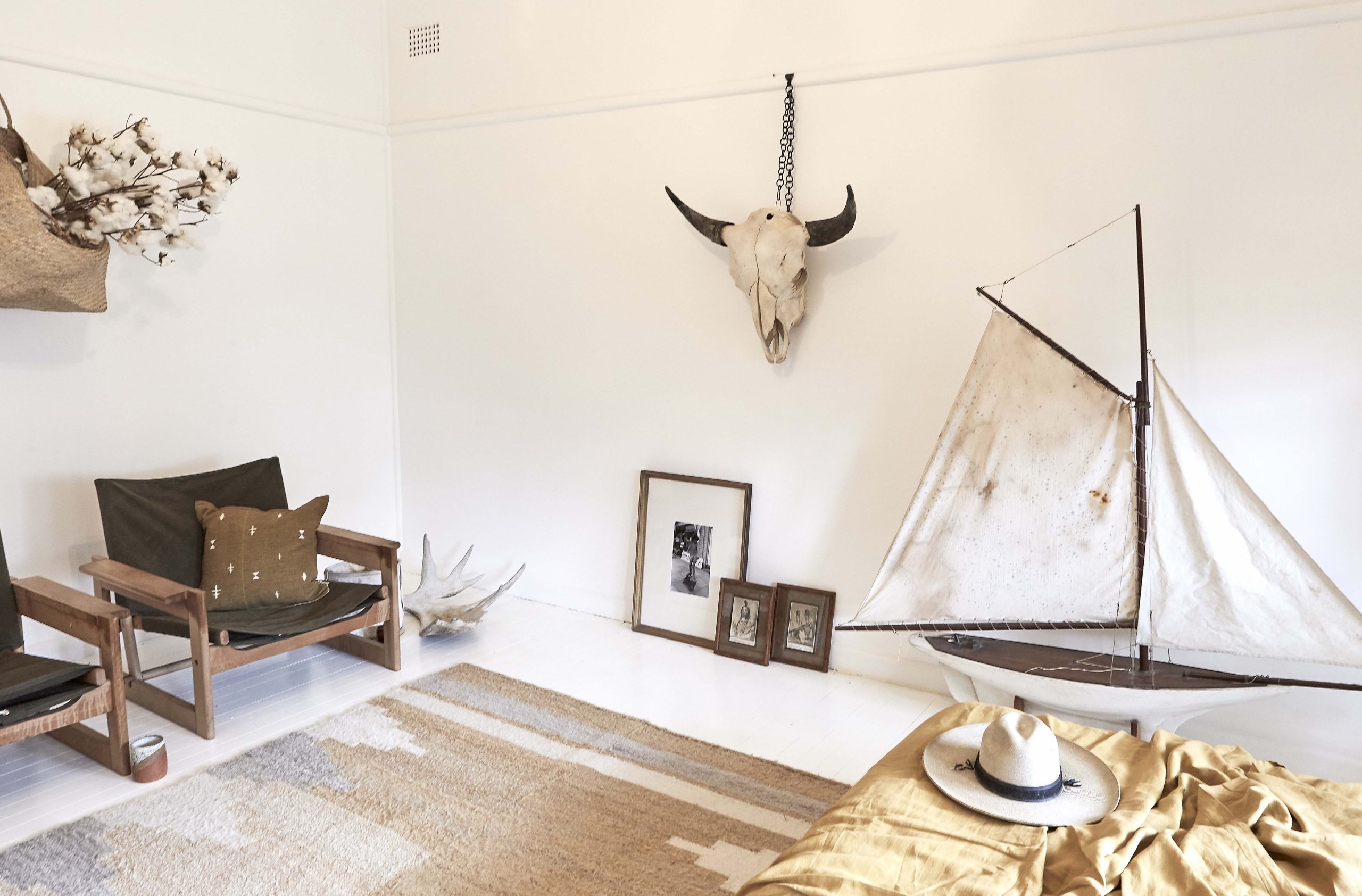
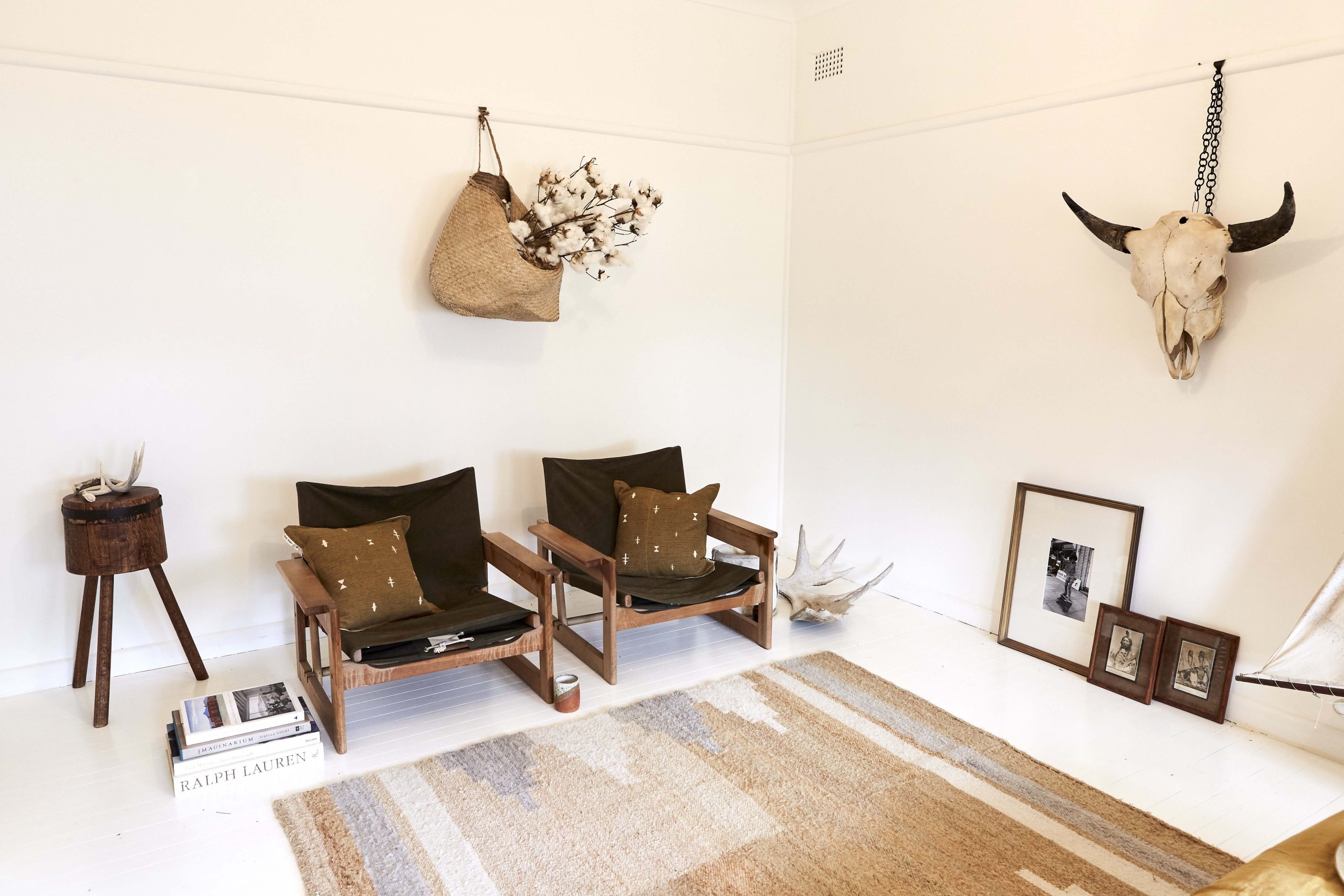
Whalebone, The Society Inc. by Murobond
Shades of white can really send you insane, something I promised myself I wouldn’t fall into. I tested two shades in different rooms with different light and opted for Whalebone. As well as loving the colour, I also knew The Society Inc by Murobond palette was created for spaces and people like me. People that wanted minimum fuss but a creative feel. How could ‘Whalebone’ not live in our fisherman shack that looked out upon the boats of passing sailors?
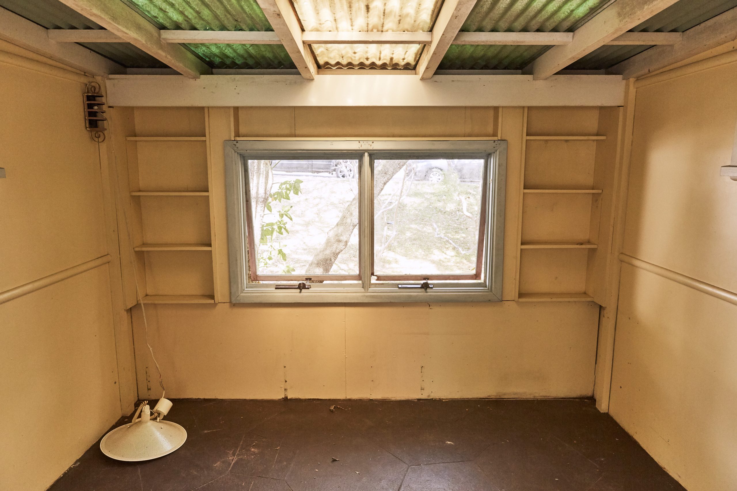
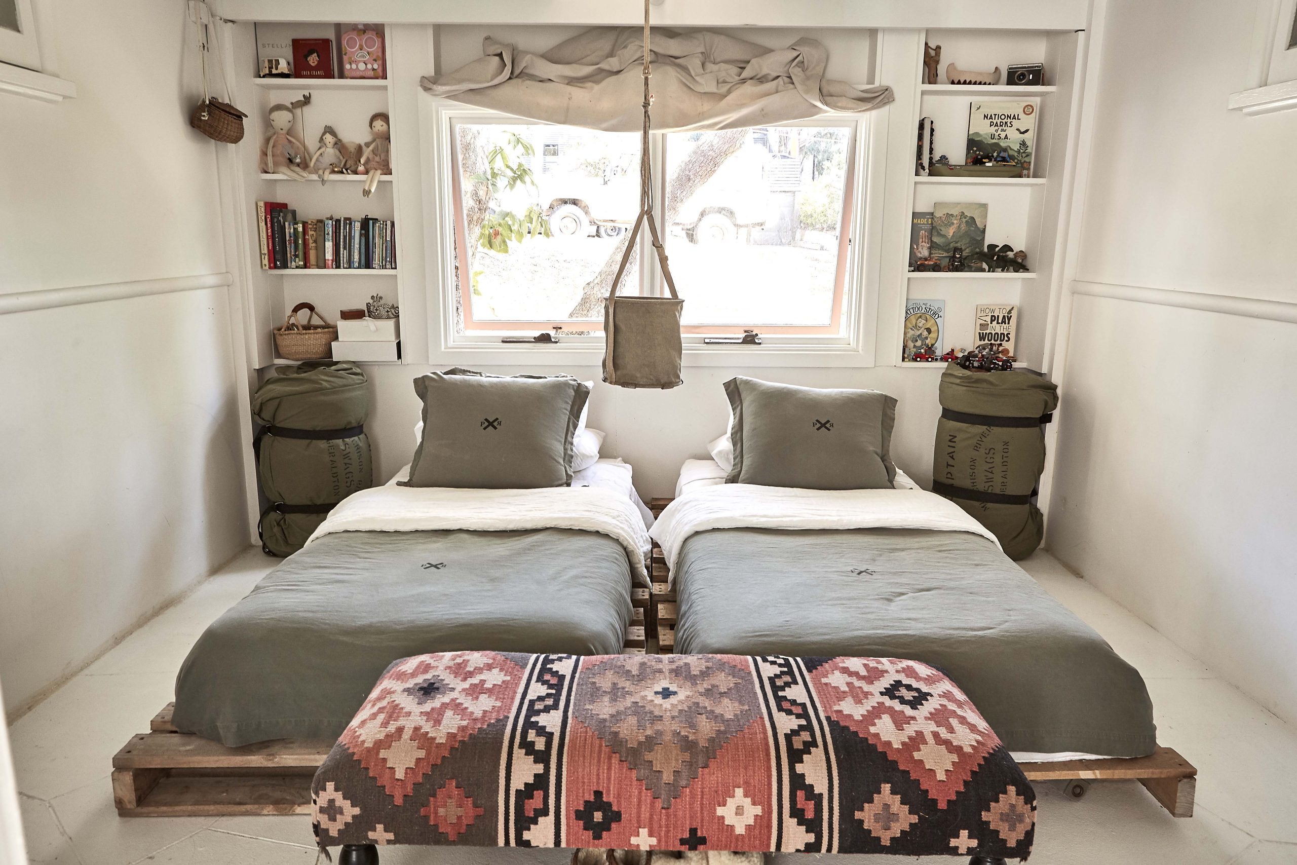
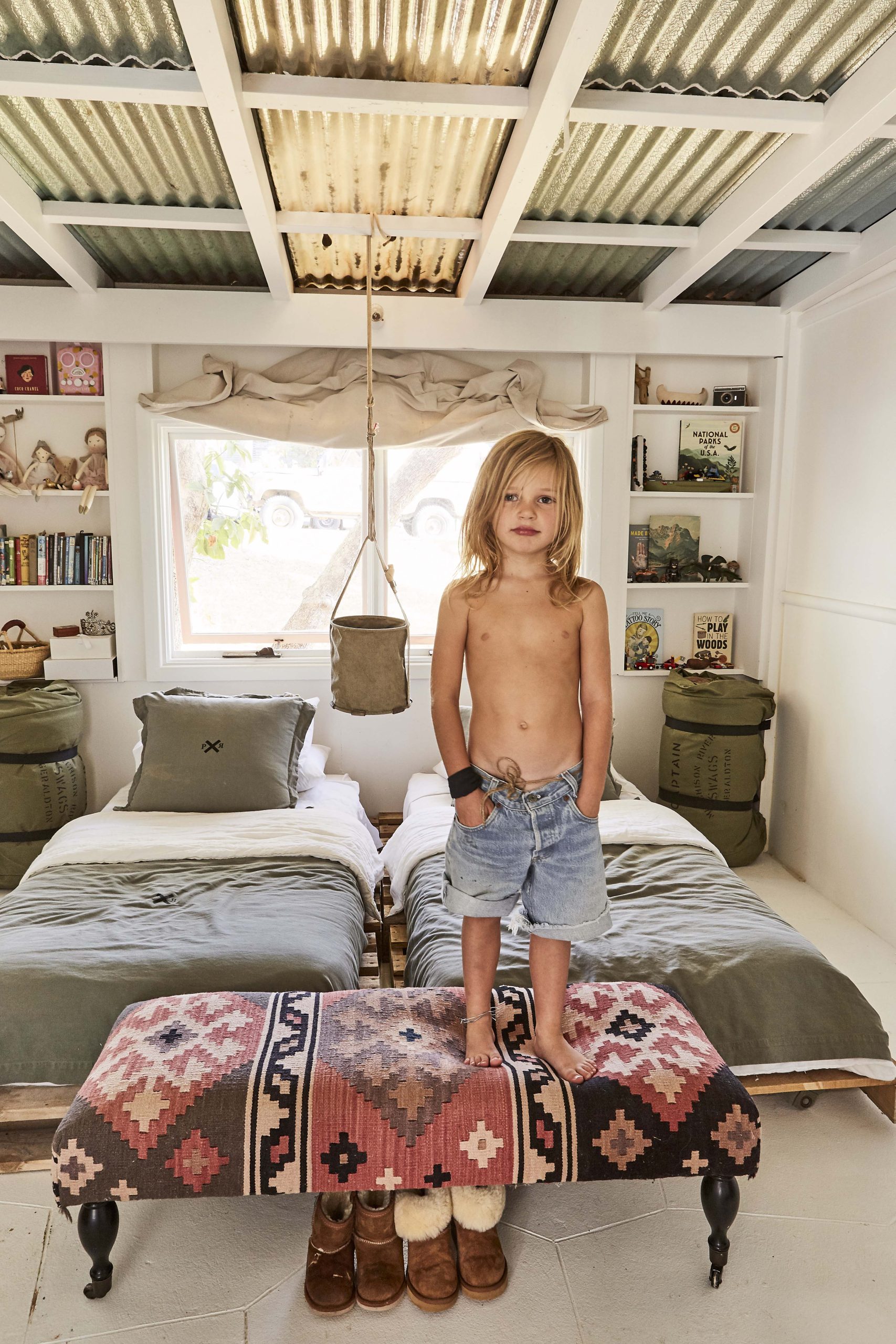
THE KIDS ROOM
Sibella and Rowena gave me the courage to ignore the old age painters’ rule that you cannot use the same shade of white for skirtings and floors as the walls etc..so Whalebone in low sheen is literally the only paint we used on every surface.
In the above picture, we used the paint even on the cement floor. We put our favourite drop sheets to good use at the end of the painting process by using them as curtains.
Bed bases were created by recycling old crates we found on the side of the road. Due to the asbestos, I haven’t put anything up on the walls but it still has a warm feel to it. Like they are permanently on summer camp.
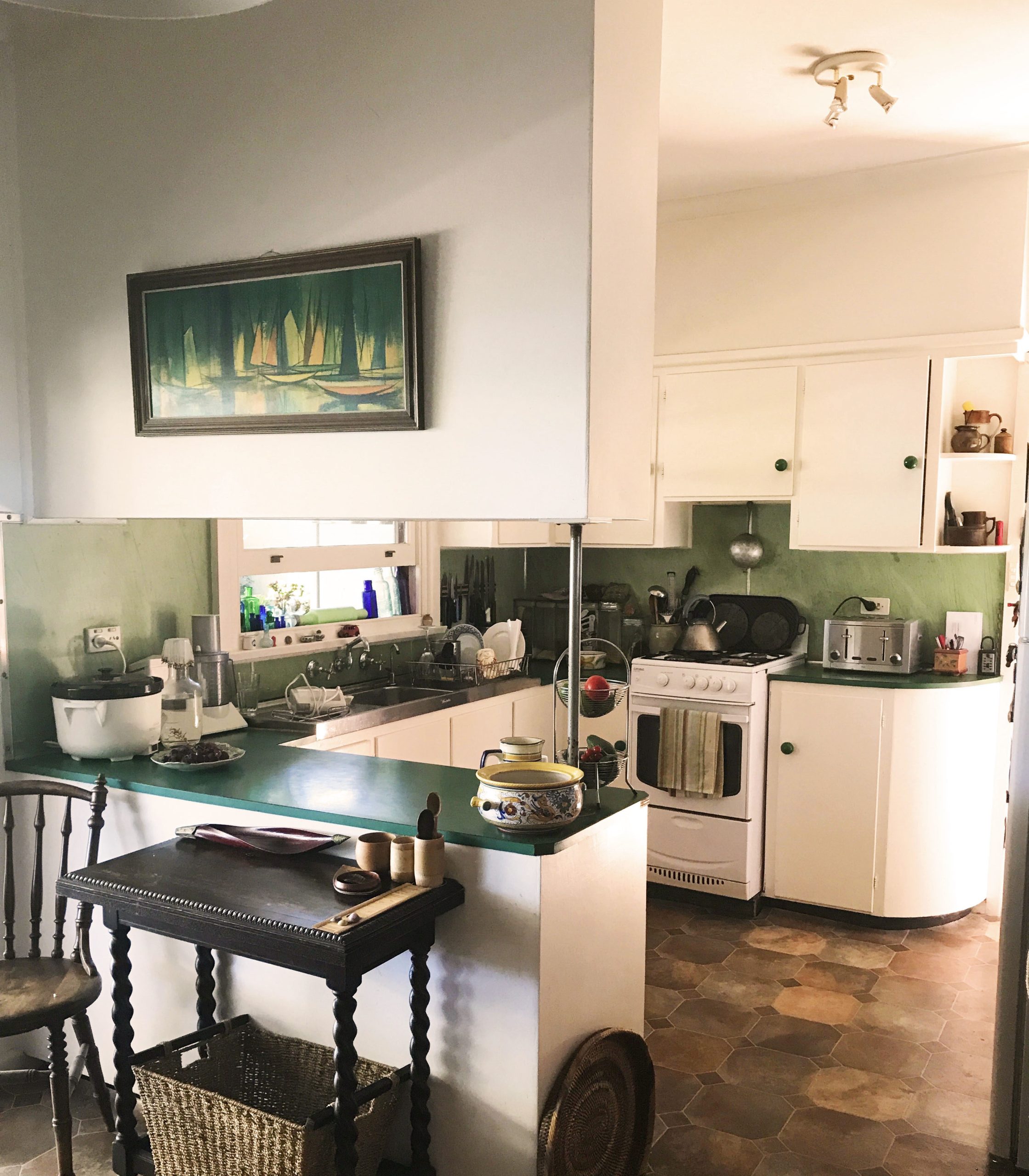
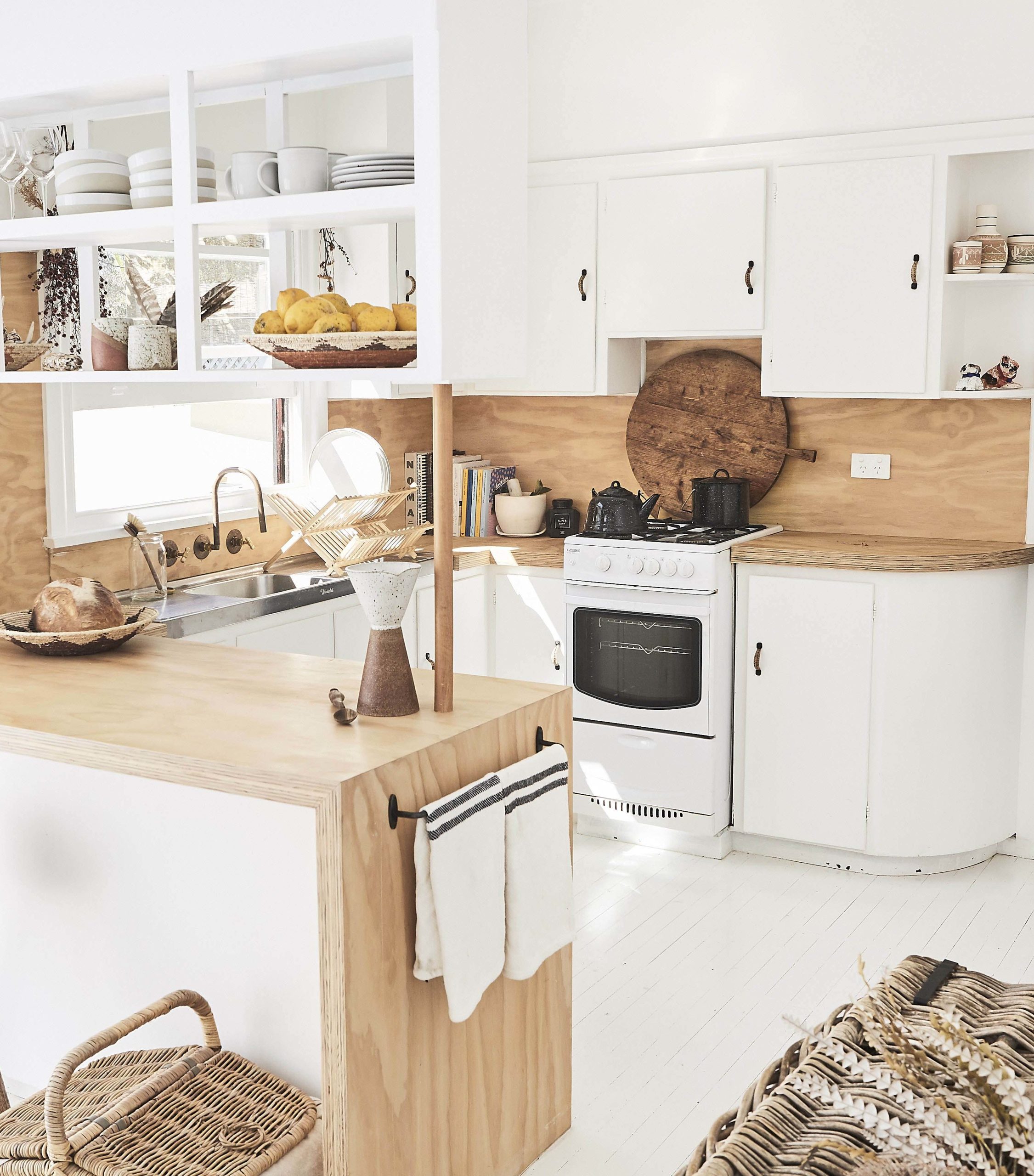
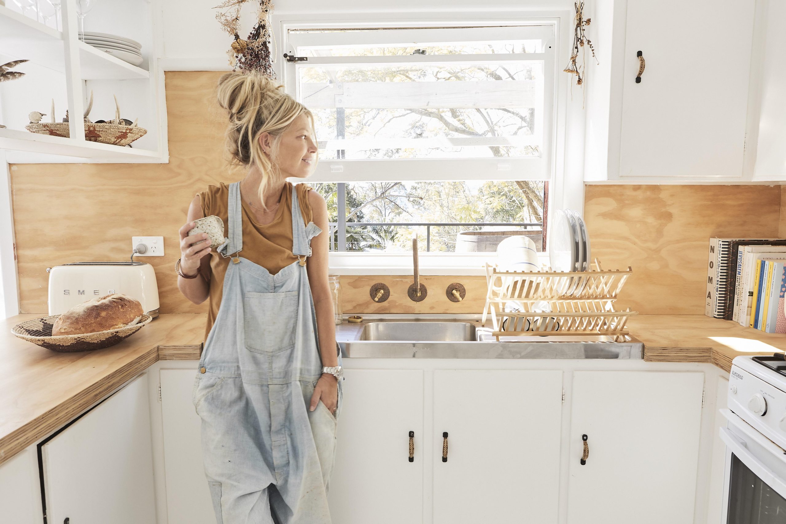
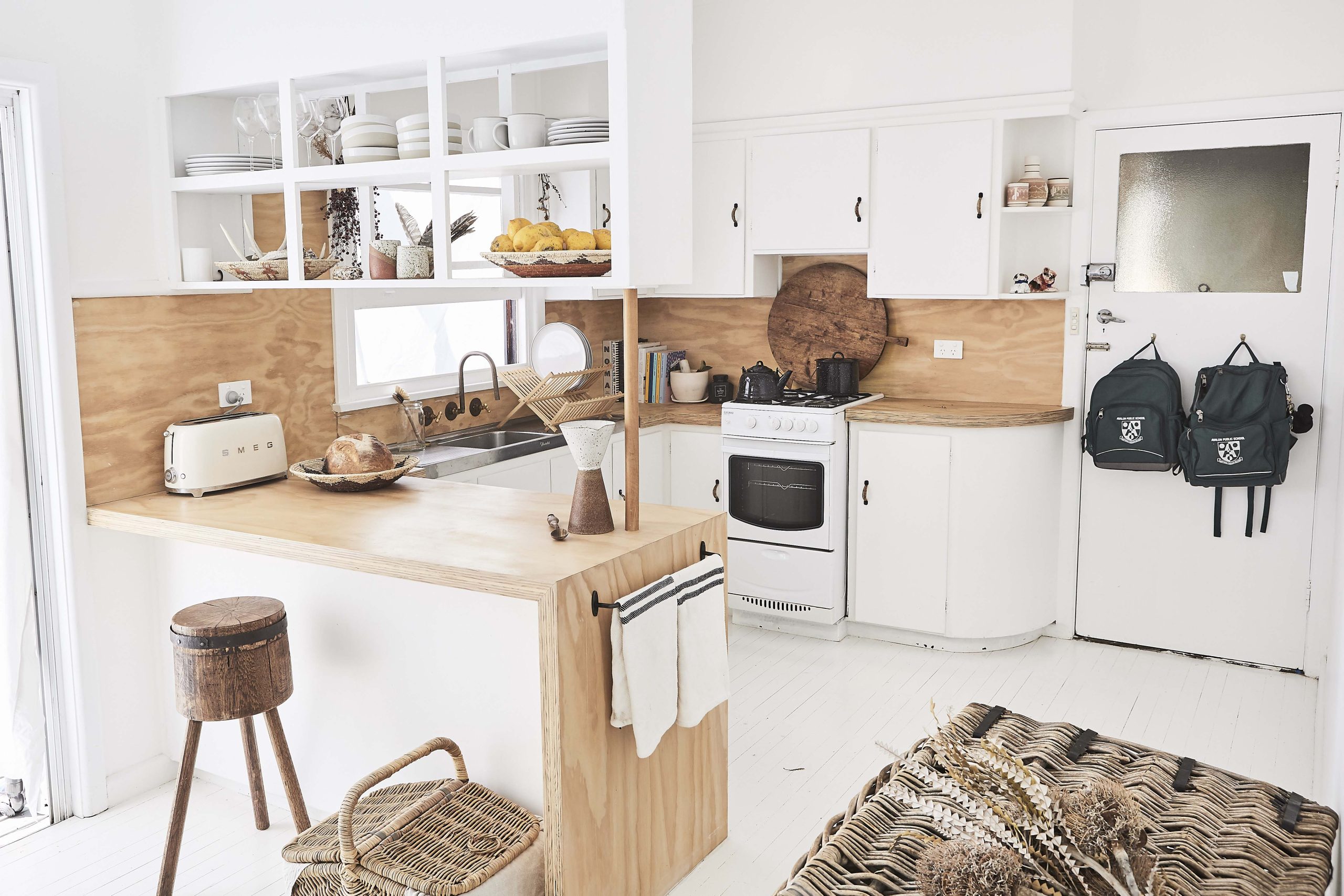
THE KITCHEN
The kitchen was my favourite room to work with. We started by ripping up the old lino and sanding back the wooden floors. Then, we literally drenched the space in Whalebone paint over and under ever crevice we could see. We did add a primer over the top of the floor paint to add extra durability which, next time, I would look for a lower chemical alternative (first lesson right there). Next, we swapped out new door and drawer handles from the Society Inc hardware range. Our mate Andrew helped Sammy cover the splash back and laminated bench tops with a sustainable plywood (FSC certified). Our local and very clever plumber, Chris, built our custom tapware in his garage with garden taps and copper piping. We also knocked out a few shelf walls so we could have some exposed shelving. We changed our light bulbs to energy saving LED lights and swapped out light fittings for second hand industrial light fixtures.

OUR BEDROOM
Good painting work takes time, so patience will be key to getting a finished look. Sammy did two coats for the floor followed by a primer coat. We know white is not the most practical option but we went in prepared to refresh every 12 months. The simplicity and brightness of Whalebone on all surfaces has made our house feel bigger and brighter, which was needed. We have not invested in new furniture but instead tweaked what we had to make it suit our new, smaller space – such as leaving our mattress on the floor and, again, using our old drop sheets as curtains.